Lapham’s Quarterly Redesign
Print design, layout, brandingLapham’s Quarterly pulls from the full breadth of human history to curate literary mixtapes of wisdom on specific themes. Each issue collects letters, fiction, poetry, essays, painting, sculpture, and miscellany from a breadth of contributors that range from Rumi, to Isaac Newton, Sylvia Plath, or David Sedaris. The Magic Shows issue examines humankind’s predilection to the illusory or marvelous, and continues the publication’s belief that history is the root of all education.
TIMELINE: 11 weeks
TOOLS: Indesign, Photoshop, Procreate
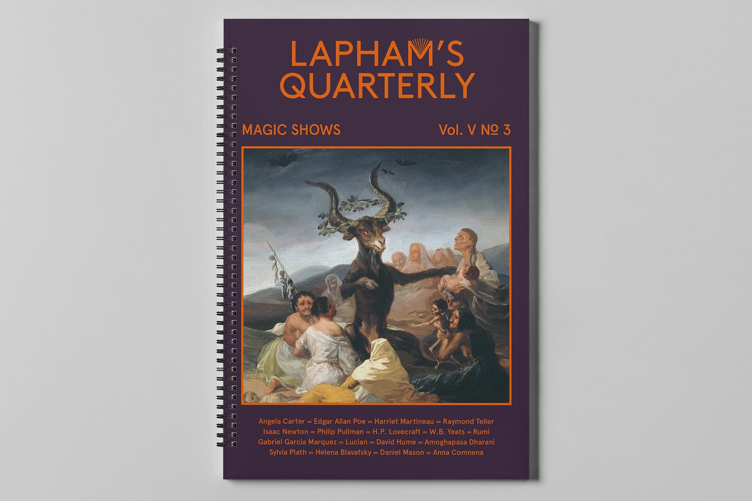
I decided to redesign the “Magic Shows” issue of Lapham’s Quarterly, because I saw an opportunity to reimagine the way the publication currently exists. Lapham's currently has a pretty scholarly, bookish feel to it — and feels very traditional and academic. But it's also fascinating and inspired, and has a sense of humor. I'd like to play up those qualities, and lean in to it's identity as a "mixtape of wisdom" rather than an (as one journalist describes it) "antidote to the age of Buzzfeed". In Lapham's, the way that the historical content "speaks" to the present is often subtle. Through my redesign I wanted to make that interplay more overt, daring, and accessible.
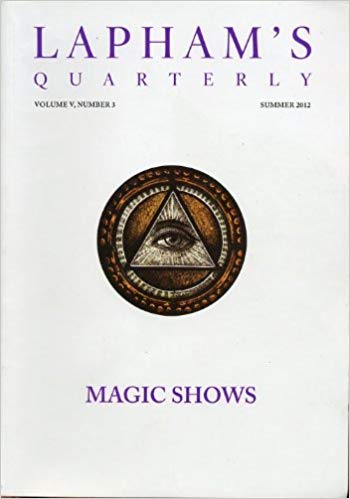
Current
design of
Lapham’s:
design of
Lapham’s:

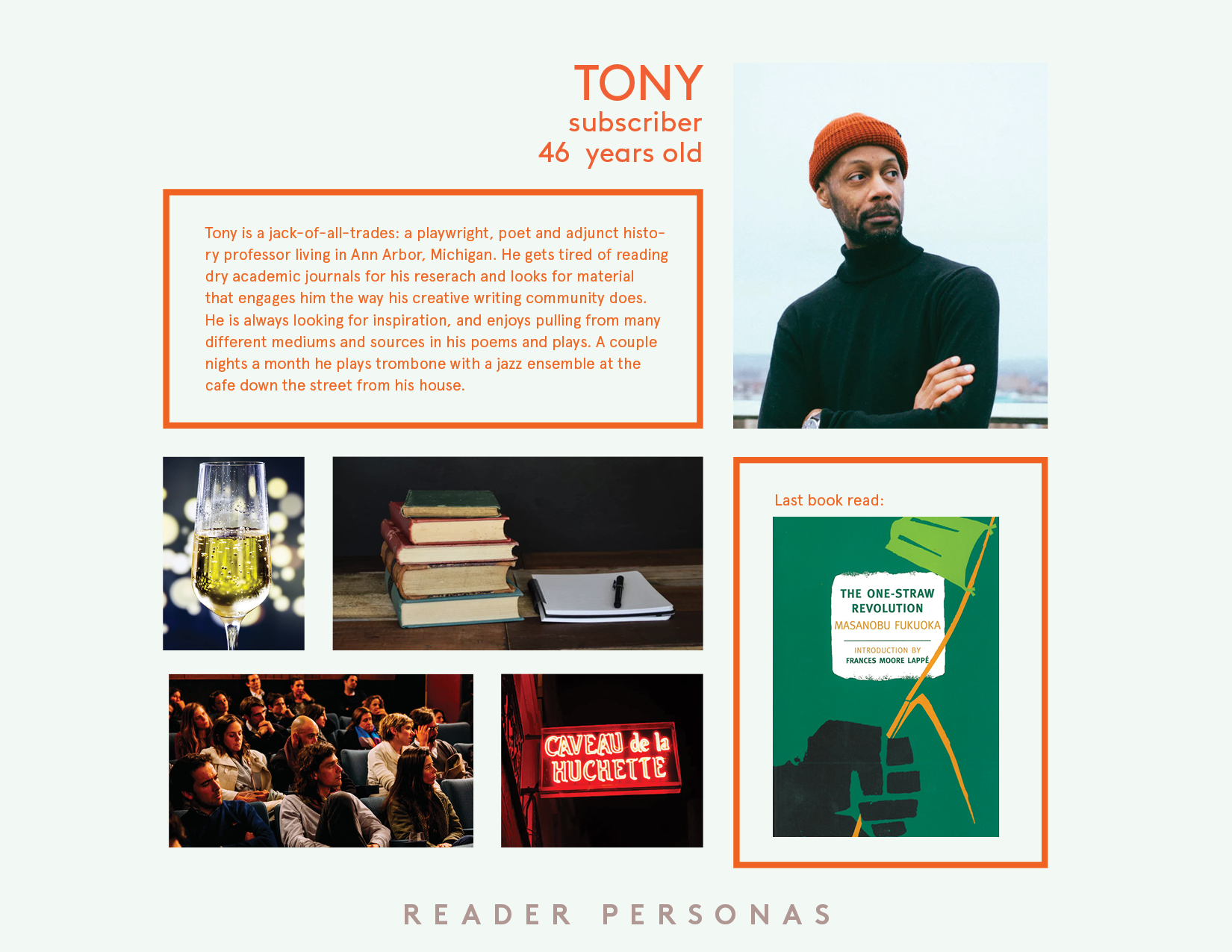
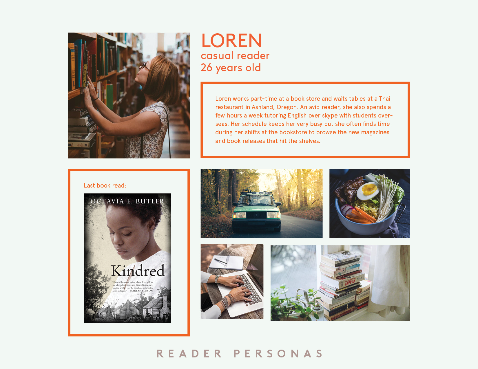
In order to understand my audience I decided to build some reader personas. I spent time at a few places where I knew Lapham’s was sold—primarily Elliott Bay Books and Cafe Presse—and tried to get a read on the people around, especially in the magazine section (or anyone who stopped to comb through the magazine rack inside the door of Presse). After this admittedly creepy phase of the project, I took those findings into account and created profiles for two types of users: a casual reader, and a subscriber.
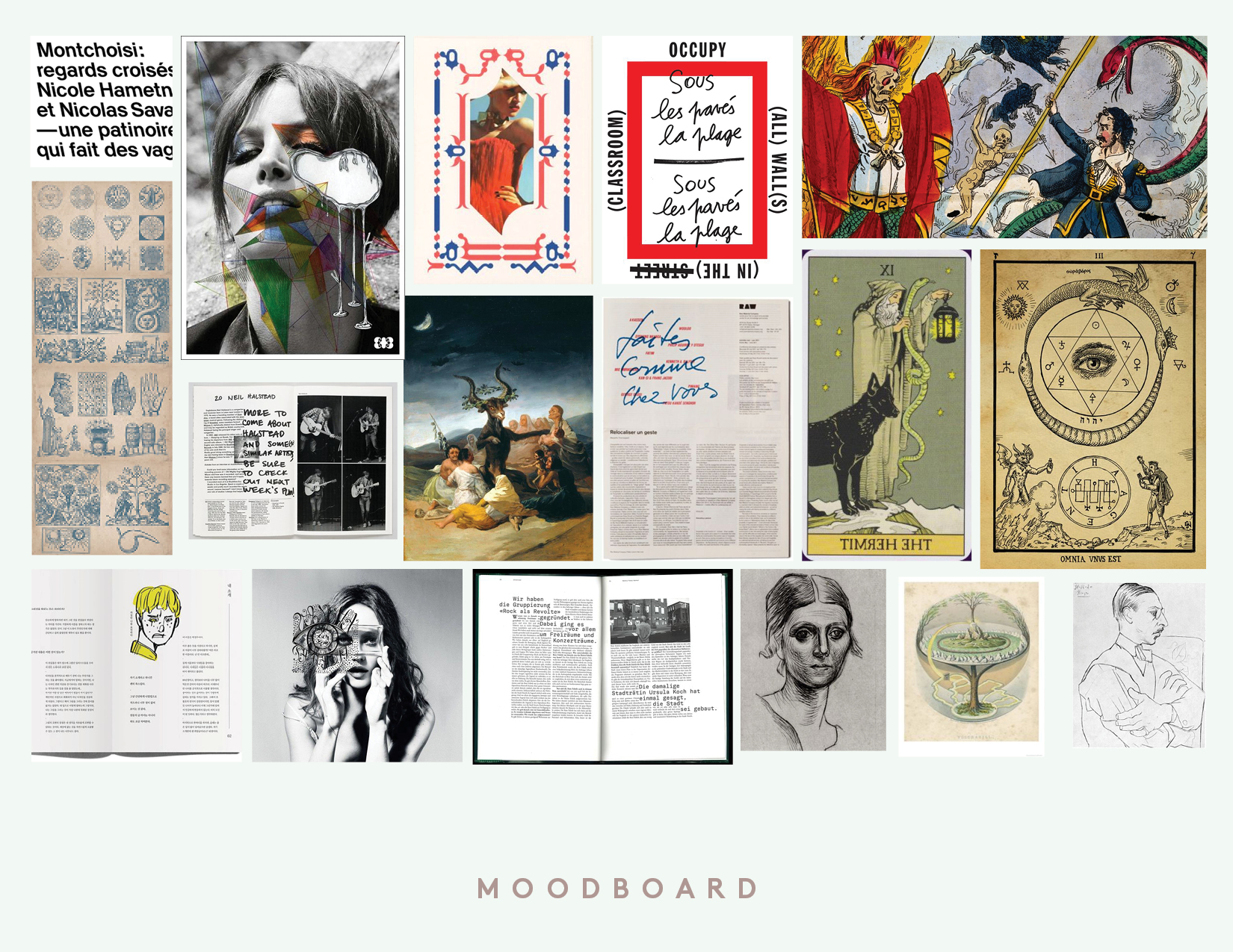
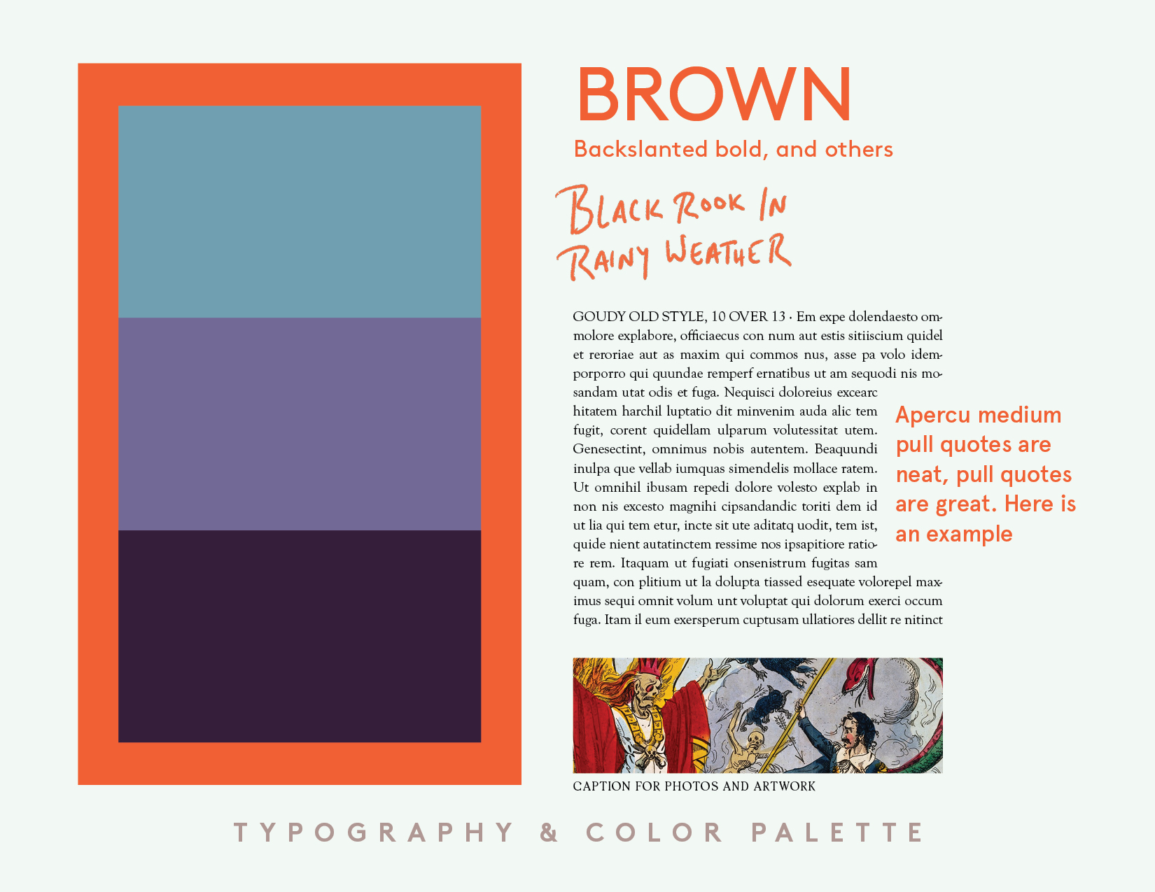
I used a few key ingredients to make a strong distinction in tone between the original Lapham’s and my redesign. Color blocking in the back of book sections were chosen to color code between the three categories of content—Metamorphosis, Sorcery, and Visitations—which, in addition to things like full bleed images and generous margins and white space, broke up the more book-like feel of the original Lapham’s, and made flipping through to one section or another doable at a glance. I used writerly, or draft-like, touches to make you feel more like you’re reading a writer’s notebook, or a scrapbook, than a polished publication—like handwritten subheads and rules, large monospaced pull-quotes echoing the typewriter, and a playful interplay between body type and artwork. I chose to spiral-bind the magazine as a way to both make it an easier way to read its larger size pages (8inx12in) on the bus or the couch, and also to again play up the mixtape/scrapbook/notebook feel of the publication.