A Midsummer Night’s Dream
Poster design, lettering, illustrationThe goal was to create a poster for the Seattle Shakespeare Company’s production of “A Midsummer Night’s Dream”. In my research, I was struck by how much all the posters for a Midsummer Night’s Dream were largely similar. For a play that has such unique magic to it, everyone was using the same symbolic language over and over again—Bottom’s donkey head, flowers, moon, etc. I wanted to subvert that in my work, and create something that expressed the heart of the play in a refreshing way.
TIMELINE: 1 week
TOOLS: Procreate, Photoshop
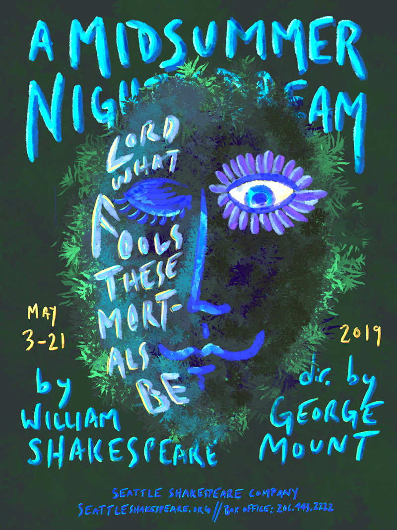
I re-read the play before I began sketching. “A Midsummer Night’s Dream”, in my reading, is about delirium, magic, and the fluidity of reality. Love is one of the main topics of the story, and there is lot of playfulness around how love can blind people. We have characters magically tricked into loving someone they didn’t before, or seeing someone through a charmed lens. Titania falls for the ass-headed Bottom, Lysander spurns Hermia for Helena, and so on—all from the mischievous actions of Puck under the direction of the spiteful Oberon.
Meanwhile there is also constant theme of Night vs Day, like two mirror images of reality; the world of the fairies and the world of humankind both existing together like two sides of the same coin. This idea lead me to sketch a face that had two different halves. One eye open, flowered, and awake—and one eye closed in sleep. I was in part inspired by the Green Man nature deity sculptures you often see at farms or forested homes.
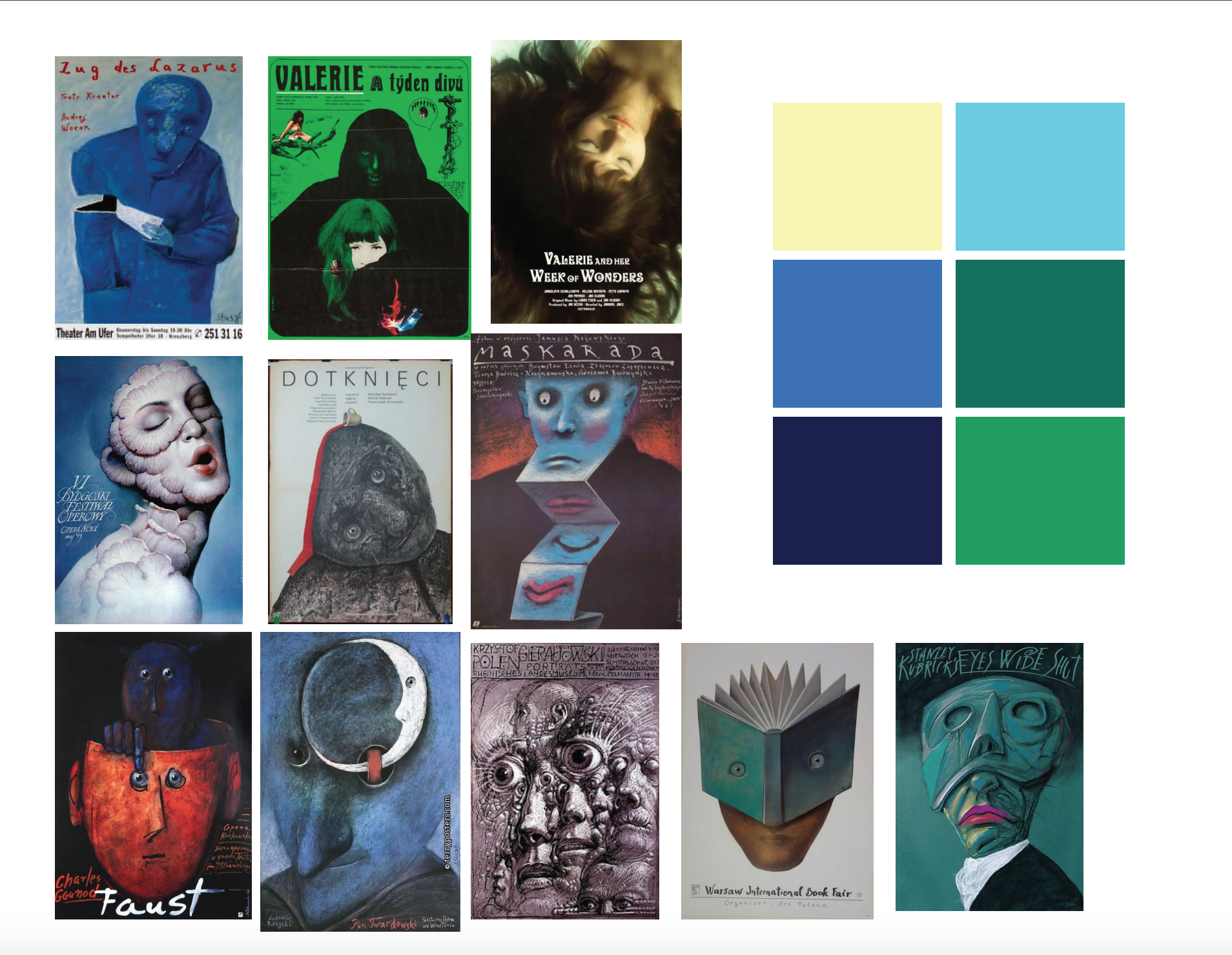
I chose to draw upon the history of Polish film posters as inspiration for this project. I thought the dark whimsy and surreality of that work was a great fit for the tone of the play and how I was reading it. The colors I chose evoke moonlight, and a hyper-real or surreal forest palette.
I wanted the expressive, painterly qualities of the Polish posters — so I worked in Procreate on the iPad to make full use of the brushes and textures I had available. I layered highlights upon highlights above the deep emeralds and blues underneath to get the effect of moonlight on forest boughs. I wanted the lettering to also be loose, expressive, painterly, and fanciful — so I made my strokes energetically with a fat brush. I chose to include a beloved quote from the play “Lord what fools these mortals be” because it so perfectly captures the comedy and spirit of the play. The quote placement also helped reinforce the dichotomy between the two halves of the face.