Panza Grotesk Typeface Design
Type design, layout, conceptualThe goal for this type design was to create an eccentric workhorse. The design draws inspiration from early grotesques, specifically Venus (1907), and also the realist Johnston (1913) — and the typeface’s personality is inspired by the character Sancho Panza from Don Quixote.
I was reading Cervantes’ novel while beginning to conceive of the project, and there were so many qualities of the long-suffering squire that I wanted to imbue the typeface with; his earthy wit, round belly, fool’s wisdom, and his playful freedom with language. I wanted to create a great sidekick — there for whatever situation arises, adaptable, and entertaining.
I was reading Cervantes’ novel while beginning to conceive of the project, and there were so many qualities of the long-suffering squire that I wanted to imbue the typeface with; his earthy wit, round belly, fool’s wisdom, and his playful freedom with language. I wanted to create a great sidekick — there for whatever situation arises, adaptable, and entertaining.
TIMELINE: 6 months
TOOLS: Glyphs, Illustrator, pen and paper
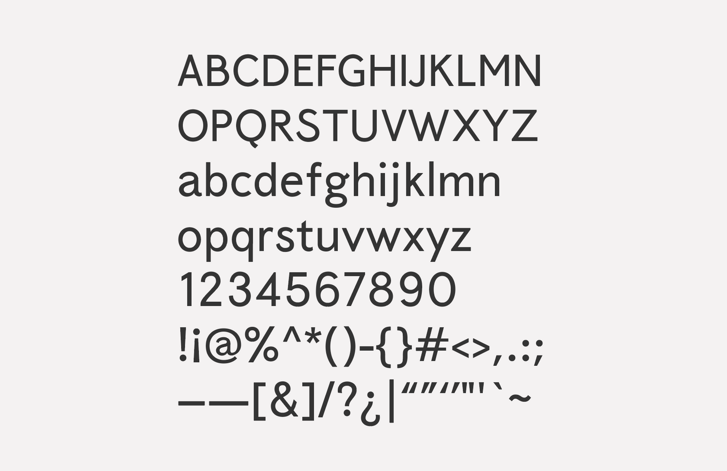
The design draws inspiration from early grotesques, specifically Venus (1907), and also the humanist Johnston (1913) — which reacted to many characteristics of those early grotesques as well as the more classical proportions of Caslon. The first inspiration for the project occurred when I started reading online to try and understand why I preferred Johnston to its descendent Gill Sans. That in turn led to an afternoon drawing lowercase “t”s, during which the idea of Panza, and of trying to design a typeface in general, began to form. The initial concept for Panza took shape over the next couple months — but it wasn’t until I discovered Venus that the approach crystallized and I was ready to begin working.
I ended up taking the humanist flair of Johnston and Gill Sans, and tried to marry that with some of the eccentricity I was drawn to in Venus—in particular the high-waisted capitals. The first 3 months were spent solely on the lowercase letterforms, and the remaining 2 months were focused on everything else.
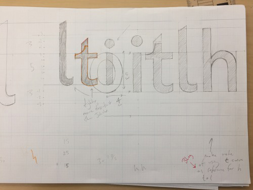

Once I had determined which type designs I was drawing inspiration from (and determining why I was drawn to them) I began sketching letters. Those sketches took on a more precise form on large graph paper, where I also took some time to nail down my vertical metrics. I taped these drawings up in the hallway to test the legibility at distance. Once I was in a decent enough starting place—I had a blueprint for most of my repeatable shapes like the curve of the n, the o, the stem and bowl letter, etc—I re-built the drawings in illustrator on a grid, brought them in to Glyphs, and began refining and re-working in the app. As I worked to complete the design I sought out feedback from peers, professors, non-designer friends, participants/experts at Type Thursday events in Seattle, and any type nerd who was willing to meet up for coffee.
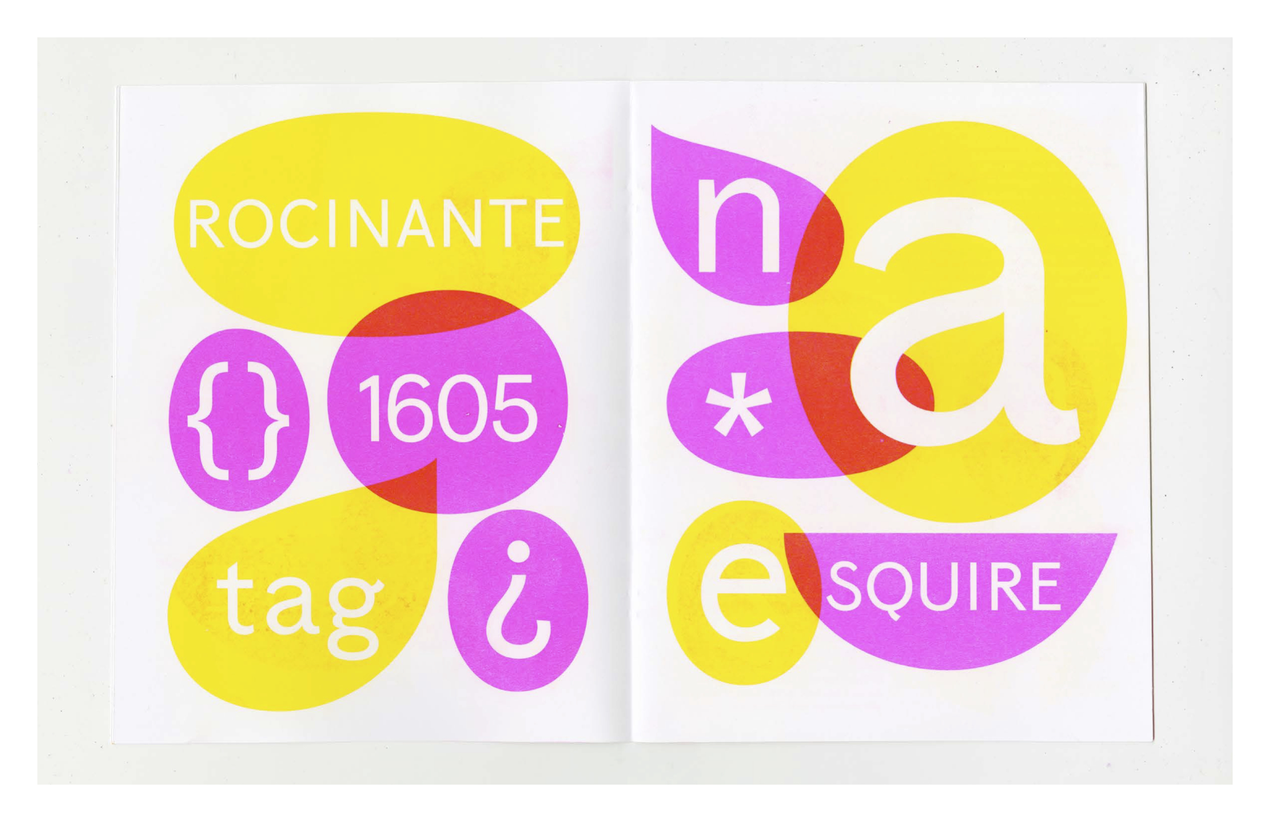
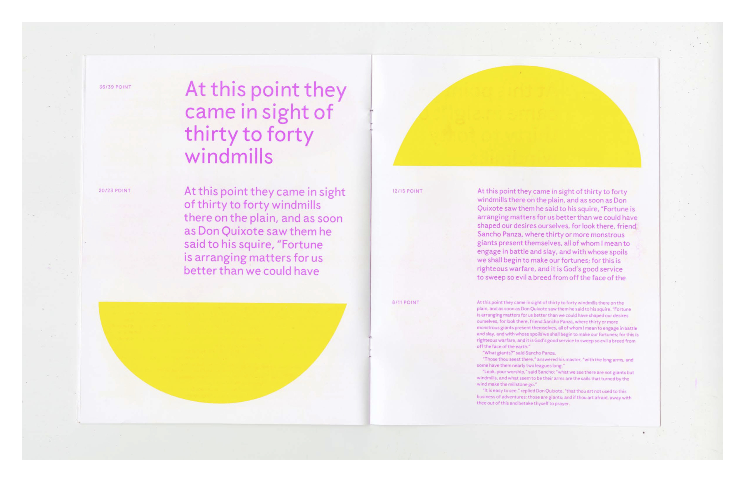
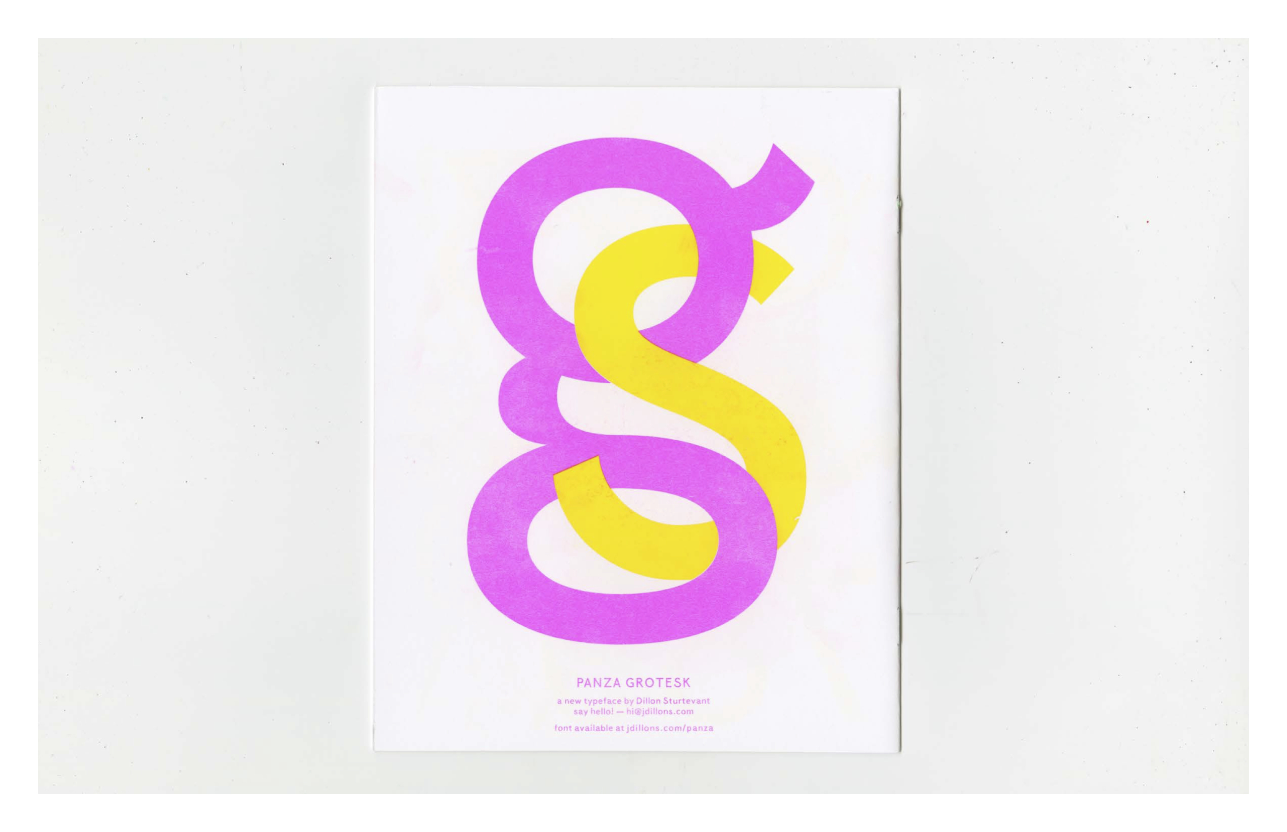
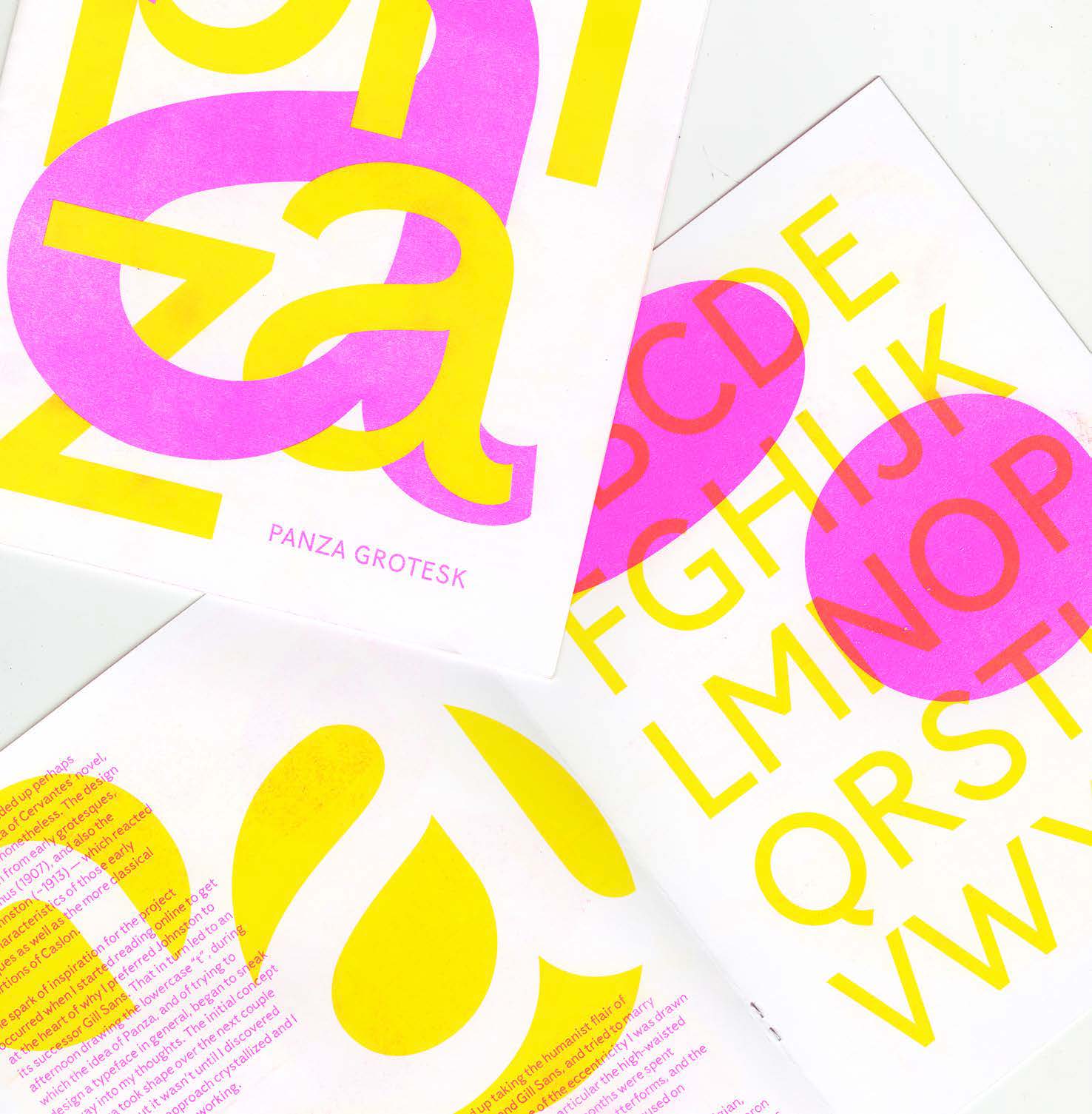
After taking winter to work on other projects, I returned to finish the design in the spring and designed a specimen booklet to accompany the release of the typeface. The specimen was printed on a risograph at Cold Cube Press in Seattle. I used it as a place to highlight the light-hearted playful personality of the design and give an overview of the concept behind the work. The organic-looking shapes used throughout are counters from the lowercase alphabet.