Motion Reel 2021
TOOLS: After Effects, Illustrator, Photoshop, Procreate, Hand-drawn, Premiere
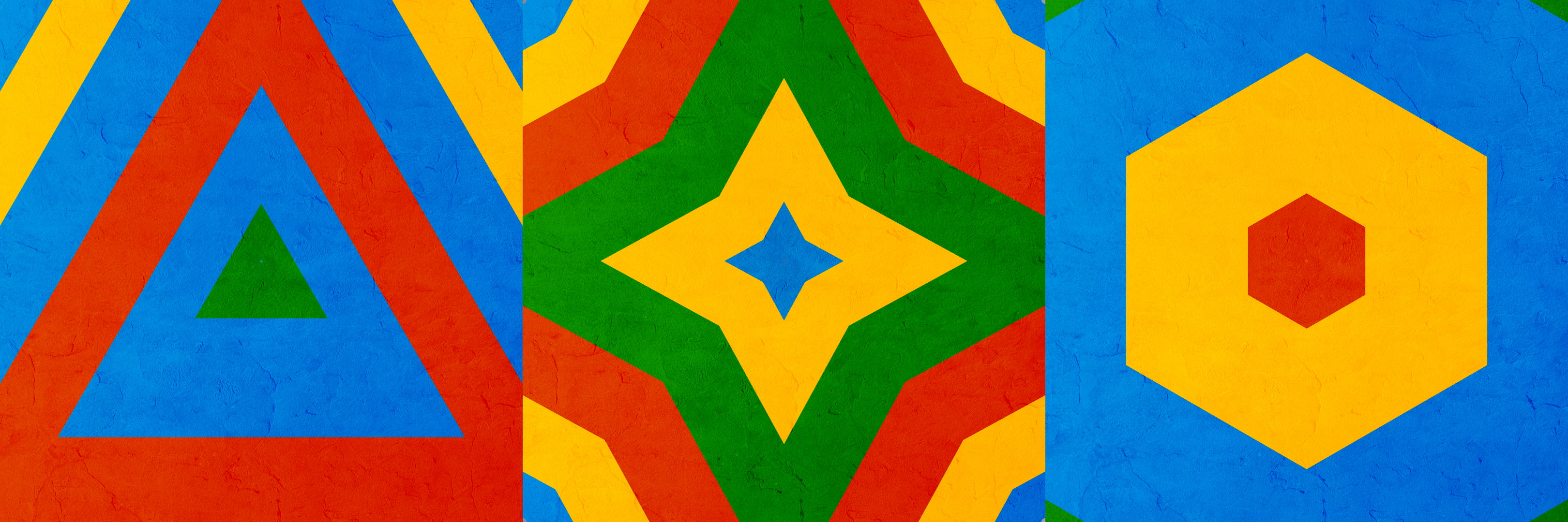
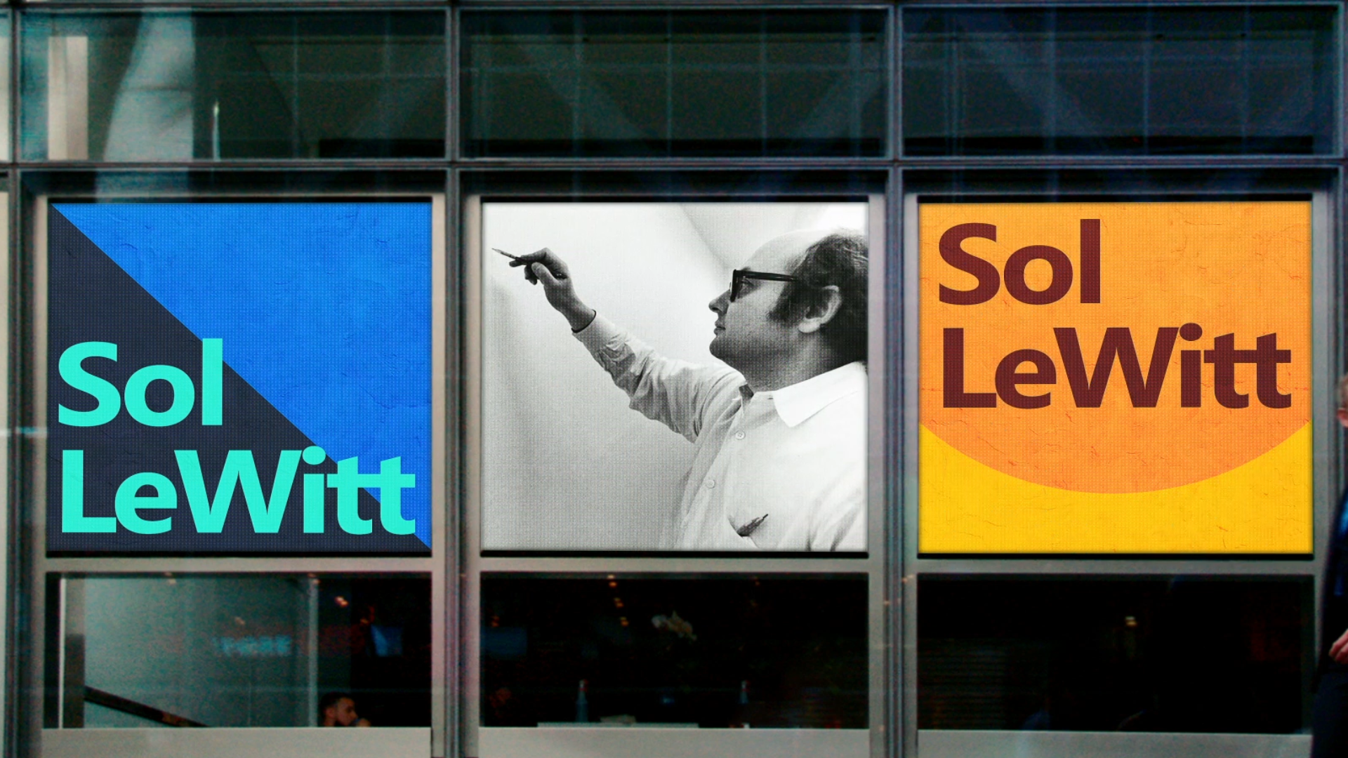
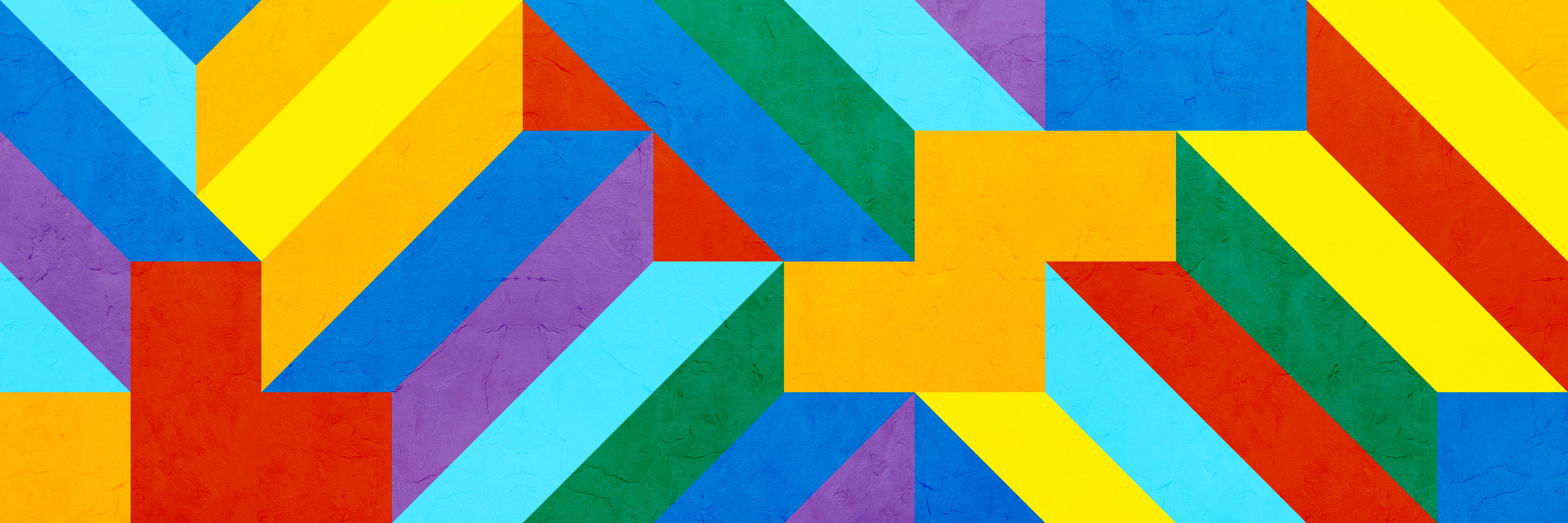
SOL LEWITT 11 TIMES SQUARE
Art direction, motion designMicrosoft’s mission statement is to empower everyone on the planet to achieve more—and so they make a point to highlight their cultural partnerships and successs stories via their In Culture content. A large chunk of the workload at my job is conforming this content—whether it’s photography, video, or other media—to play on the large outdoor displays at the Microsoft store at 11 Times Square, NY.
NYC curator and LeWitt specialist Lindsay Aveilhé used Microsoft AI to power an app, which allows users to get a exploratory experience of LeWitt’s work and legacy (story here). Our source media was a number of images of the artist, his work, and his sketches from the digital exhibit.
NYC curator and LeWitt specialist Lindsay Aveilhé used Microsoft AI to power an app, which allows users to get a exploratory experience of LeWitt’s work and legacy (story here). Our source media was a number of images of the artist, his work, and his sketches from the digital exhibit.
TIMELINE: 2 weeks
TOOLS: After Effects, Photoshop, Illustrator

Typically my team is either given rough storyboards from our client (the Microsoft brand team) or we create boards ourselves and move into animation. For this project, there was no clear direction given —so I was tasked to bring this collection of images to life on the 11 Times Sq. displays from concept to execution.
I drew inspiration from the work itself, and created a variety of geometric graphic transitions emulating the systematized compositions of LeWitt. The typewriter-style text transitions echo the sketchbook/process-oriented focus of the exhibit, and the color blocking was all given a hand-touched painterly texture to appear like the art.


The goal of this work is to drive people to visit the Microsoft In Culture content online and increase positive awareness of the brand at work in the world. With no precise way to grab a metric of how many passersby saw the piece and then visited the site, the work simply had to be as eye-catching, clear, and delightful as it could be.
When the result was delivered, one of the primary stakeholders was so excited by the creative on the piece she said she’d risk an NYC snowstorm and Covid (this was January 2020) to take the subway to get some photos of it from the street. Maybe not the most scientific metric of success—but still encouraging support for this solution!


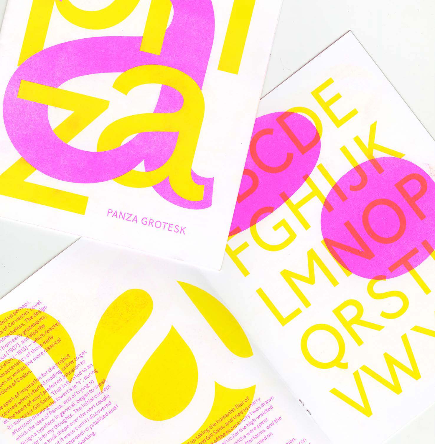
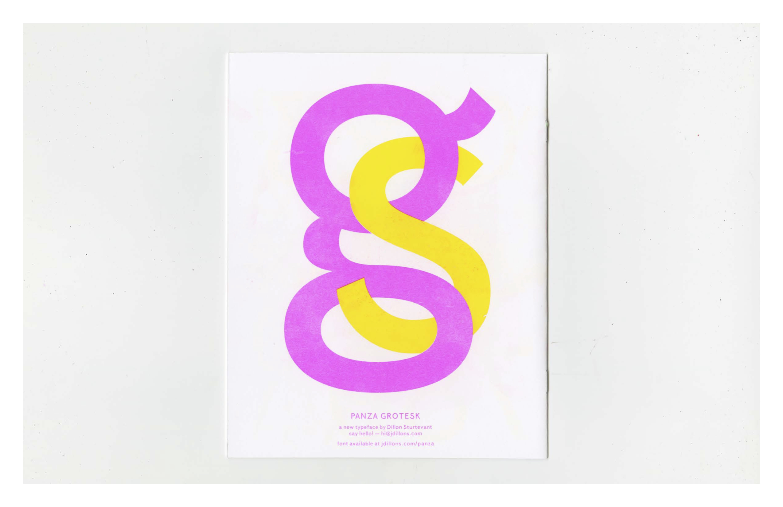
Panza Grotesk Typeface Design
Type design, layout, conceptualThe goal for this type design was to create an eccentric workhorse. The design draws inspiration from early grotesques, specifically Venus (1907), and also the realist Johnston (1913) — and the typeface’s personality is inspired by the character Sancho Panza from Don Quixote.
I was reading Cervantes’ novel while beginning to conceive of the project, and there were so many qualities of the long-suffering squire that I wanted to imbue the typeface with; his earthy wit, round belly, fool’s wisdom, and his playful freedom with language. I wanted to create a great sidekick — there for whatever situation arises, adaptable, and entertaining.
I was reading Cervantes’ novel while beginning to conceive of the project, and there were so many qualities of the long-suffering squire that I wanted to imbue the typeface with; his earthy wit, round belly, fool’s wisdom, and his playful freedom with language. I wanted to create a great sidekick — there for whatever situation arises, adaptable, and entertaining.
TIMELINE: 6 months
TOOLS: Glyphs, Illustrator, pen and paper
The design draws inspiration from early grotesques, specifically Venus (1907), and also the humanist Johnston (1913) — which reacted to many characteristics of those early grotesques as well as the more classical proportions of Caslon. The first inspiration for the project occurred when I started reading online to try and understand why I preferred Johnston to its descendent Gill Sans. That in turn led to an afternoon drawing lowercase “t”s, during which the idea of Panza, and of trying to design a typeface in general, began to form. The initial concept for Panza took shape over the next couple months — but it wasn’t until I discovered Venus that the approach crystallized and I was ready to begin working.
I ended up taking the humanist flair of Johnston and Gill Sans, and tried to marry that with some of the eccentricity I was drawn to in Venus—in particular the high-waisted capitals. The first 3 months were spent solely on the lowercase letterforms, and the remaining 2 months were focused on everything else.
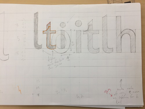

Once I had determined which type designs I was drawing inspiration from (and determining why I was drawn to them) I began sketching letters. Those sketches took on a more precise form on large graph paper, where I also took some time to nail down my vertical metrics. I taped these drawings up in the hallway to test the legibility at distance. Once I was in a decent enough starting place—I had a blueprint for most of my repeatable shapes like the curve of the n, the o, the stem and bowl letter, etc—I re-built the drawings in illustrator on a grid, brought them in to Glyphs, and began refining and re-working in the app. As I worked to complete the design I sought out feedback from peers, professors, non-designer friends, participants/experts at Type Thursday events in Seattle, and any type nerd who was willing to meet up for coffee.
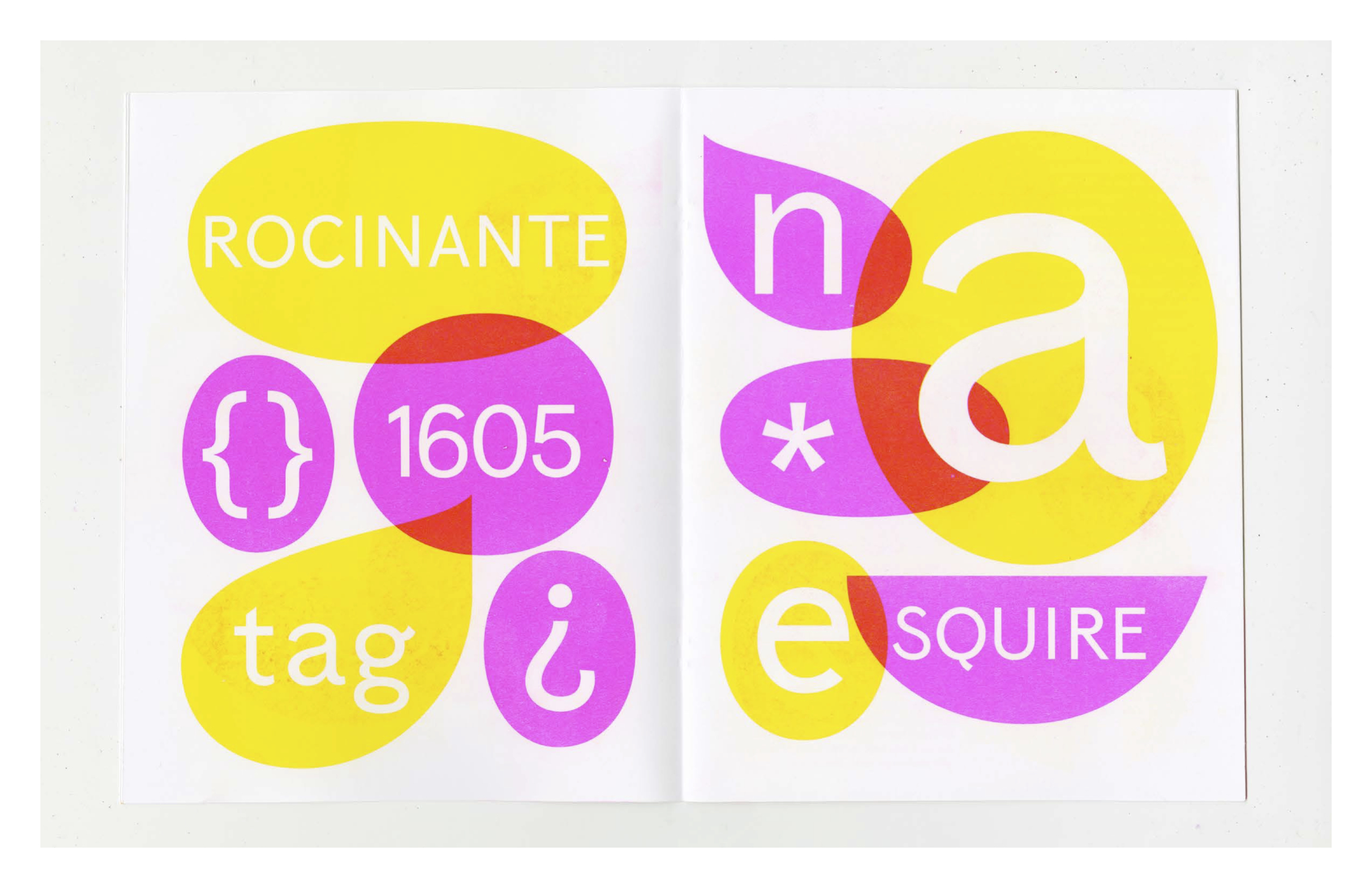
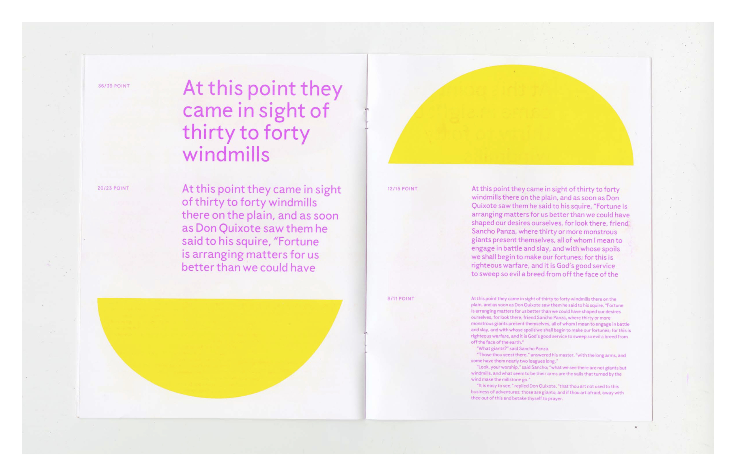
After taking winter to work on other projects, I returned to finish the design in the spring and designed a specimen booklet to accompany the release of the typeface. The specimen was printed on a risograph at Cold Cube Press in Seattle. I used it as a place to highlight the light-hearted playful personality of the design and give an overview of the concept behind the work. The organic-looking shapes used throughout are counters from the lowercase alphabet.


DOMINO
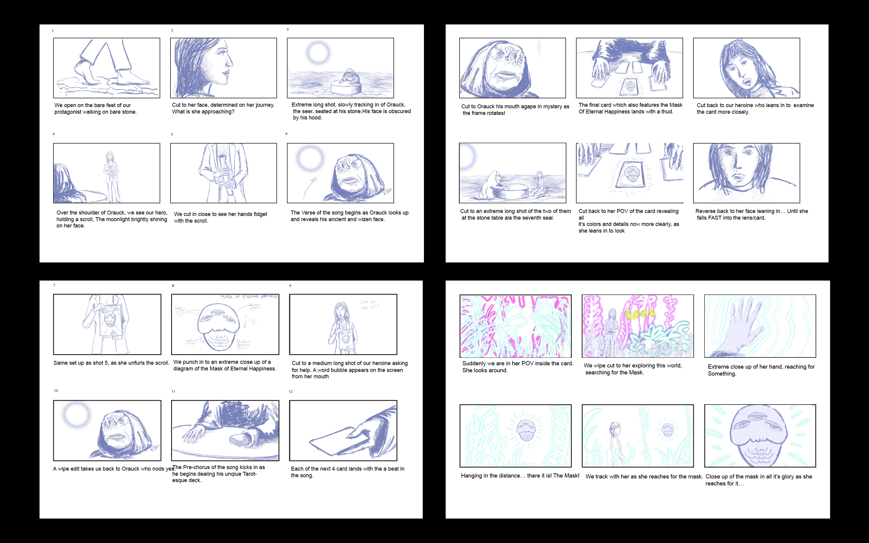
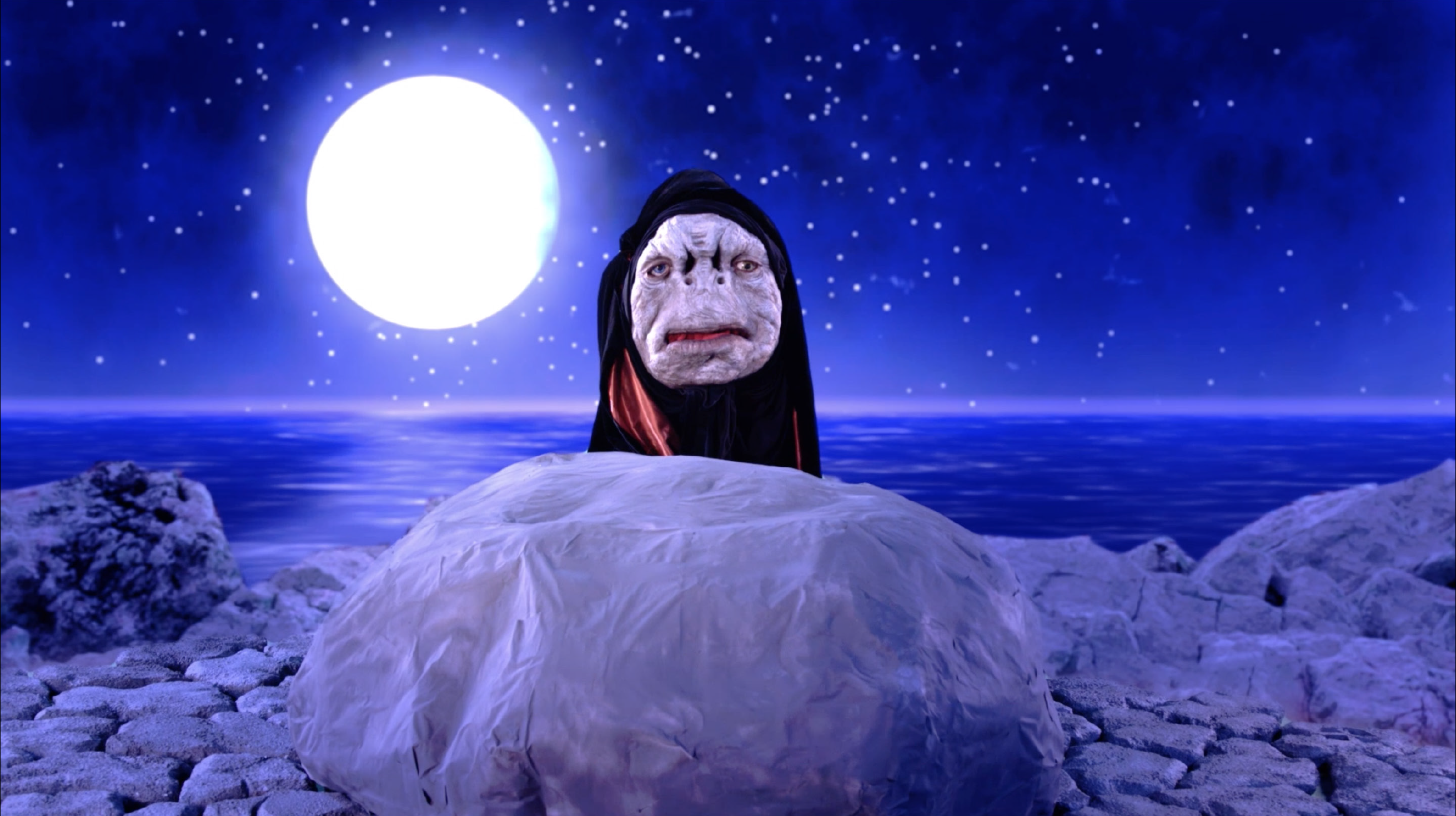
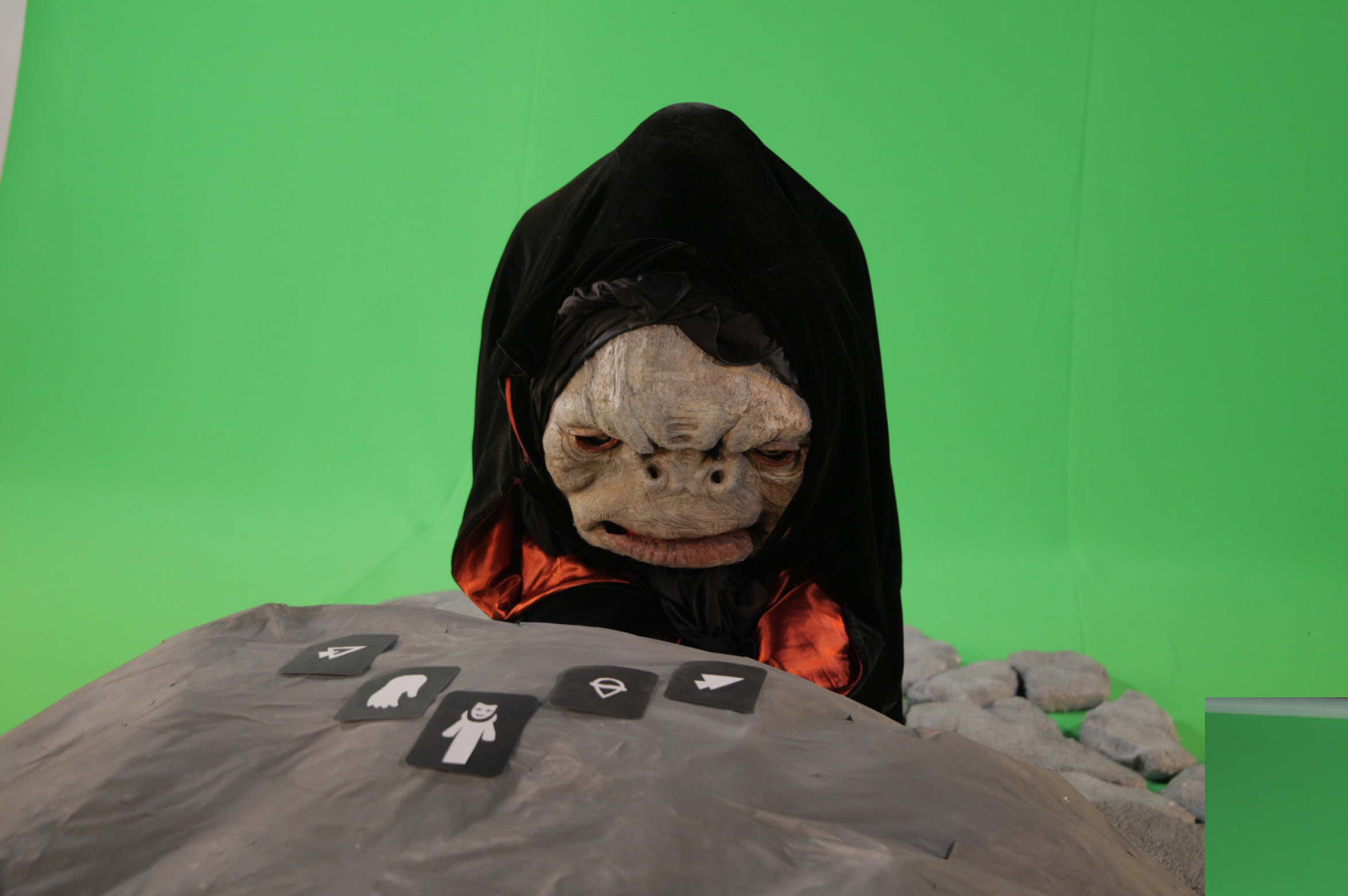
Art direction, direction, animation, compositing, editing, storyboarding, writing. music productionThe goal for this project was to create a music video that placed a practical set and live actors into fully animated environments, which were built in After Effects and Premiere.
This video is for a song called ‘Domino’ my band released in October 2018. I had been kicking around a rough version of the music video concept over the fall of 2019, and finally began sketching out ideas after having a conversation with Ali El-Gasseir — a local producer and creative (currently a Creative Director at Watts Media). I worked with Ali on sourcing cast and crew, as well as lining up the use of Canon C200 for the shoot on green screen at the Seattle Central Creative Academy studio.
You can view the original treatment here.
TIMELINE: 12 weeks
TOOLS: After Effects, Photoshop, Premiere, Procreate
TEAM:
Producer: Ali El-Gasseir
Camera: Jess Clark
Orauck the Oracle: Elijah Evenson
Domino: Linnea Ingalls
Hair, Makeup, PA: Hannah Clark & Ab Glanz
Song: ‘Domino’ by John Dillon
I carried the vision of the project from the original treatment and sketches, through storyboarding, creating a shotlist, and into the final animation, editing, compositing, and color-correction.
This video was an amazingly difficult and rewarding self-directed passion project, and gave me the chance to deeply explore the capabilities of After Effects and Premiere. The collaborations with local sculptor/performer Elijah Evenson, actor Linnea Ingalls, and producer Ali El-Gasseir were both fruitful and creatively satisfying. I hope to work with any or all of them on more projects in the future.
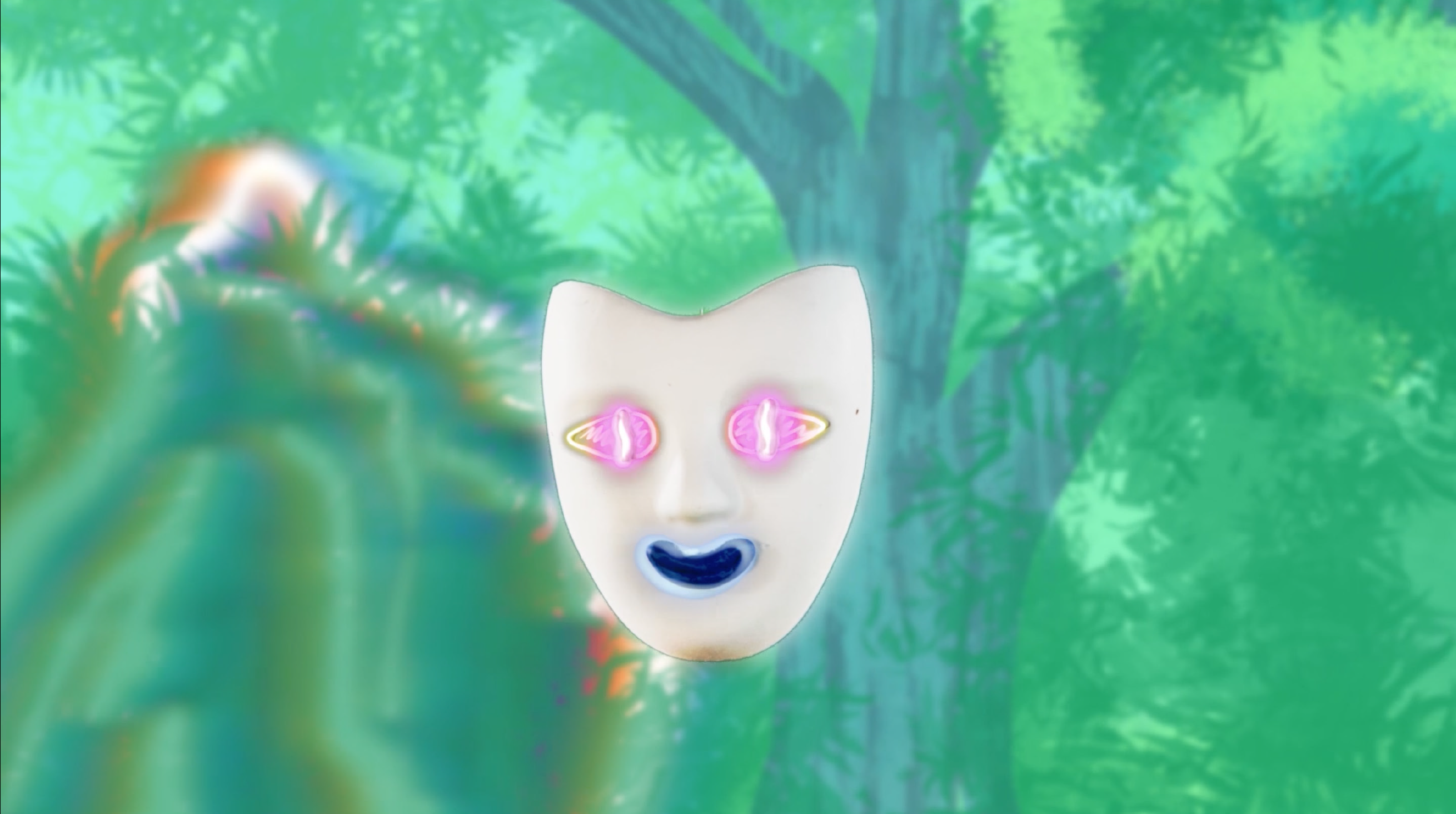


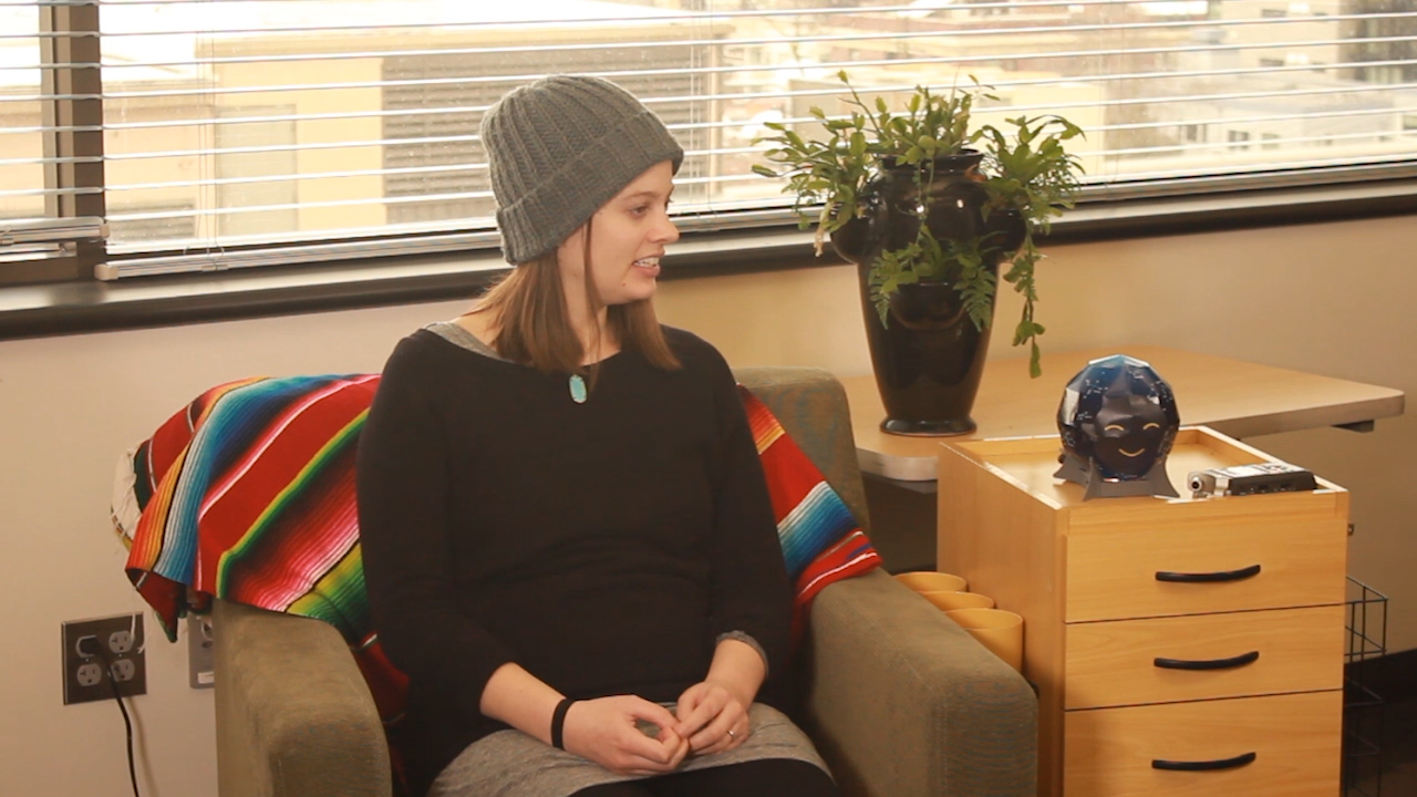
Mae: Voice Interaction Prototype
Product design, multimodal & voice designMae is a conversational toy for children and adults that projects the night sky and can tell you all about the stars, constellations, and the mythologies behind them. Maria Randall and I wanted to try our hands at the voice design process, and creating a testing environment to verify and refine the fundamentals of Mae’s voice interactions. We decided to focus on pauses, confirmations, and error states
TIMELINE: 8 weeks
TOOLS: Whiteboarding, Python, Premiere
TEAM ROLES:
DILLON: Voice UI, user testing, UX research, filming
MARIA RANDALL: Voice UI, user testing, UX research, identity & illustration
JUDILEE HAIDER: UX research, storyboarding, animation
Judilee Haider and Maria Randall initially conceived of MAE as a conceptual interactive product for a prototyping assignment in our Motion Design class at Seattle Central Creative Academy. Maria and I had been chatting about and exploring design solutions in the voice and multimodal design space—so we decided to explore building out MAE’s interactions beyond the preliminary conversation flows she and Judilee had put together as part of the original project.
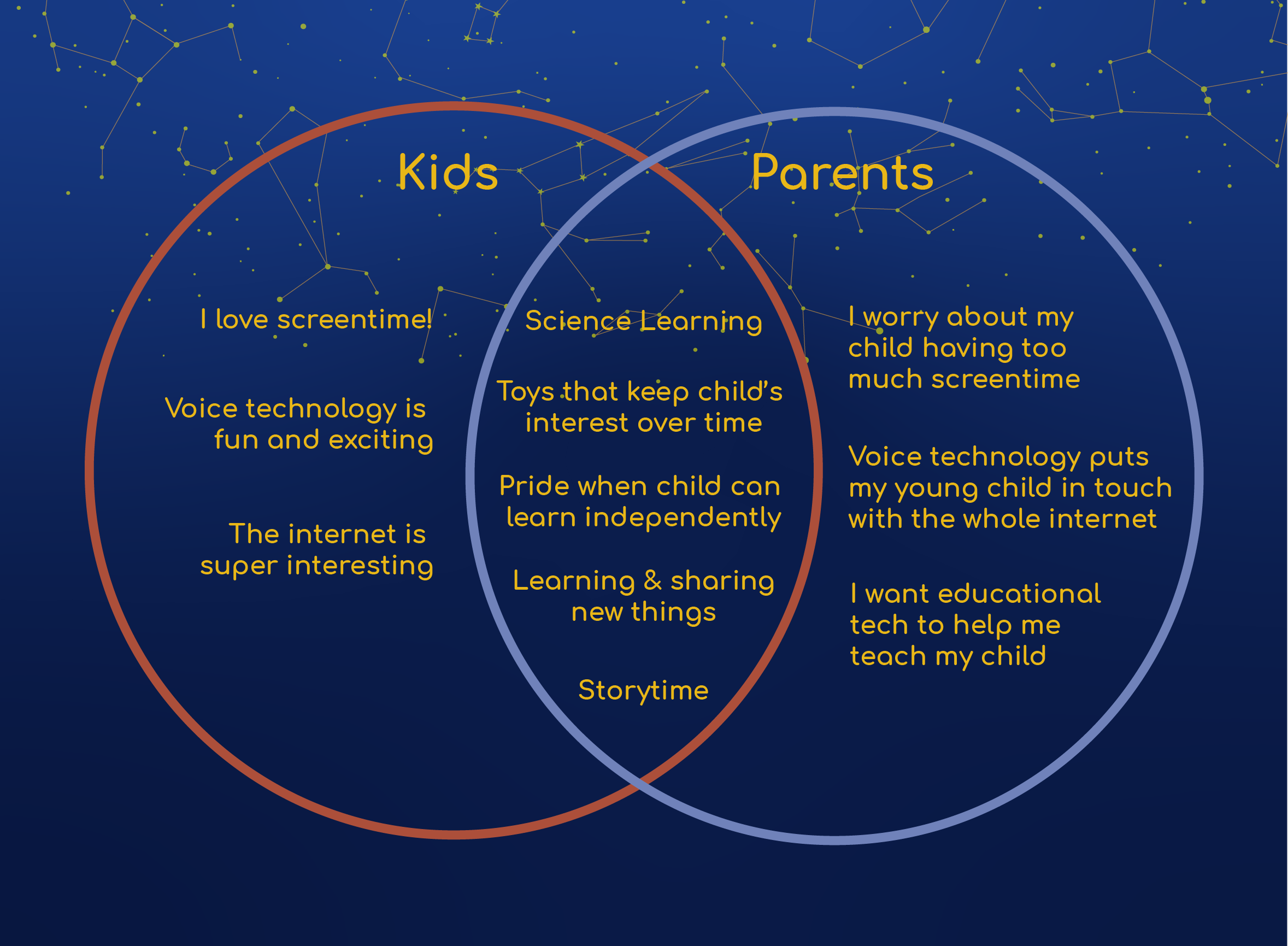
We wanted to address the problem of tech and screetime-based toys impairing child development (JAMA Network). We saw an opportunity to create a tech-based educational experience that was actually good for kids. Mae’s voice interaction and wall projection interface allows for a screen-free, multimodal, immersive, and healthy educational experience for kids to learn about the stars in the night sky.
Mae is still in essence a toy—therefore our user needs had to be the overlap between the child who interacts with the product, and the parent who sanctions and purchases the product.
Voice Design
testing process
After trying out a few different approaches—from the lowest-tech methods (a completely analog testing) to the highest-tech (many thanks to the kind folks at Orbita who gave us a sandbox version of their voice design platform to work with) we ended up somewhere in between, but skewing low-tech.
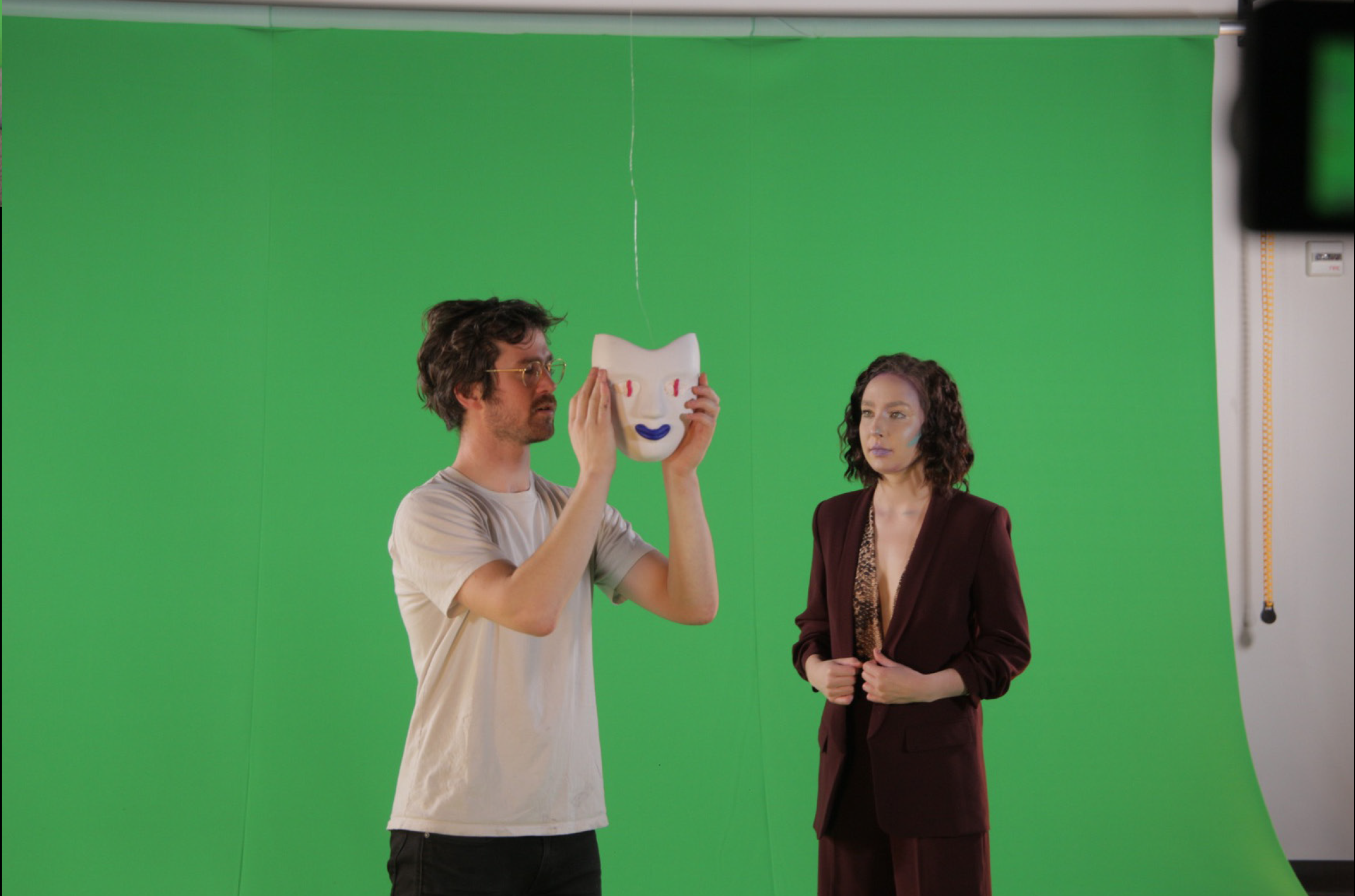
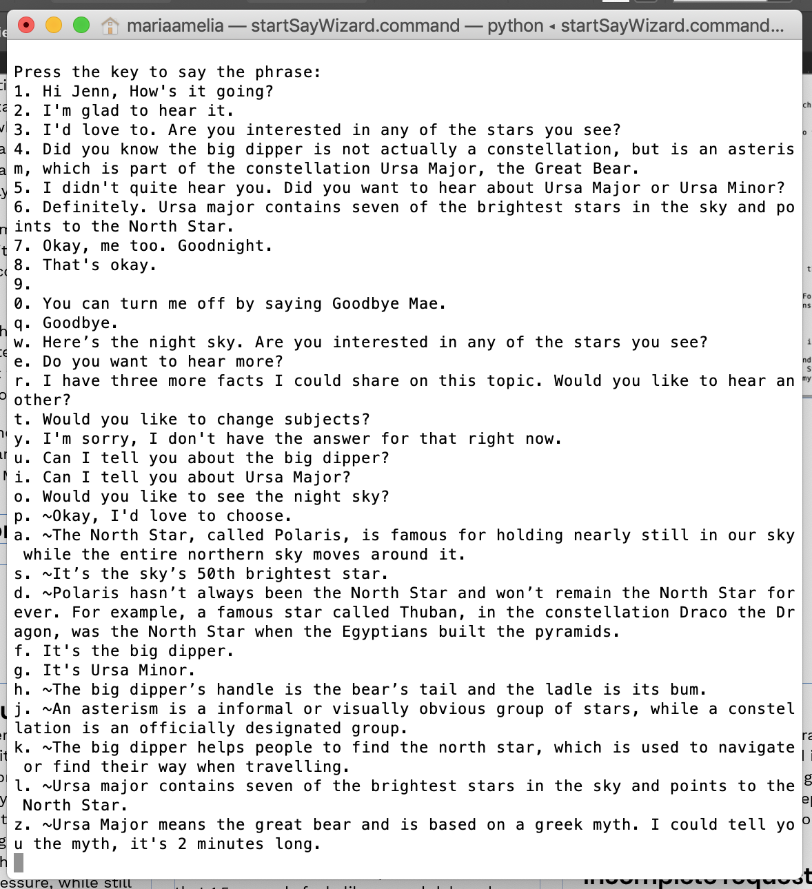
We did what is referred to as “Wizard of Oz testing”, i.e. we had a guy behind the curtain. We set up a python script that allowed pre-built responses to be played at the touch of a laptop key, which were sent to a Bluetooth speaker into a physical Mae prop we built out of a small cardboard constellation globe and a lightbulb. We spent days whiteboarding “happy paths” until we got a bank of flow responses with which we felt we could get actionable insights from vis testing on reeal people. For the projected UI, we just held up a large paper printout of what the user would see on the walls and ceiling of their bedroom.
After our first round of tests we came to a few critical conclusions:
1 Mae needed to sound more friendly and conversational.
2 She needed to guide the user into an interaction by prompting them with an option immediately when she wakes up.
3 We needed to A/B test for how much she should prompt a user vs. how passive she should be.
4 We needed to A/B test for pause length: how long should she wait for the user?
Through our rounds of testing we had to make drastic changes to the script and sometimes to the physical considerations of the testing environment. After the the first few scripts proved to be far more complex to control and execute than we anticipated, we learned to create shorter scripts that would wholly focus on one small aspect of each interaction. Mae is fundamentally a different type of interaction than a product like Alexa—but we were able to cross reference our results with some of the newfound best practices in voice design we had researched for products like Alexa, Google home, and Siri.

In the 5 weeks (6-8 hours per week) we gave ourselves to build our voice design process and practices from the ground up, we were amazed at how deep the process became—and how few concrete product features we came out with in that limited timefram. We would’ve loved a larger team and more time!
With our findings, we determined Mae needed to wait 4 seconds before prompting a silent user further with a question or follow-up. This was longer than the recommendations we gleaned from our research; but again, Mae is, at her core, an exploratory and educational experience, and the user will often be lying on their bed or sitting and looking up at the “stars”. Naturally, a 4-second pause in this type of situation will feel relatively quick compared to a 4 second pause from Alexa when you’re, say, trying to figure out what time a restaurant opens.
Below are the primary product features we came out with from our testing.
Teaching users
How passive should Mae be? How does she teach a user how to interact with her? Does Mae prompt a user after she shares a fact or story—does she wait quietly or ask the user if they’d like to hear more right away? We want the experience to feel open-ended and low-pressure, while still teaching users how to make the most of their interaction with Mae.
This is an example of Mae teaching a user what she does upon initial wake.
How long are her pauses?
Is this longer in children than in adults? This proved our most fertile ground for testing, and it is different in a mult-turn dialogue, when she first wakes up, and after she’s shared a fact or story.We’d read that 1.5 seconds feels like a good delay when the user is expected a response from Mae, but what about after Mae had replied, and is waiting passively to see if the user will interact with her further?
We decided that Mae should prompt a user after 4 seconds of being woke, if they hadn’t made any requests, with “Would you like to see the night sky?” or similar, and that she would prompt a new user after each fact with “Do you want to hear more?” or variant, and an experienced user only some of the time.
Errors and incomplete requests
It’s important to have Mae reiterate whatever slot or word she has recognized in order to move the user forward and not get stuck in a loop—we know children often repeat the exact same wording of their request for long periods when they are not understood.
We determined that she should give the user options if she can hear the intent, following the “one breath” rule of thumb, after waiting 4 seconds, in case they correct themselves.